It’s all in a name, right?
When you are shopping, what do you look for? It’s those tried-and-true products that are the go-to items on your list. What do you look for as you’re racing through a weekday shopping trip, before you have to get home and make supper (and attend to the other dozen things going on)? That label. The color or letter or design catches your eye, you grab it, and it’s off to the next item. Checked off the list.
Now it’s Your Turn
You have this amazing product. It tastes or looks or wears wonderful. How do you label it to grab someone’s attention and make them want to buy it? What do you call it? Is there a phrase that will stick in the customer’s head so they say it whenever they think of your product? What colors should you use? What will catch someone’s attention? Should you add a picture? What kind of picture should you use? Should the whole design have a shape? What shape? Such a mountain of questions bombard your mind. It’s downright boggling!
First of All Breathe
You can’t focus on your label with a scattered brain. Next thing is to let your intuition take over. Go with what looks and feels right. Don’t second-guess yourself. The first question is, How do you want to portray your product? Who are you trying to sell it to? This makes a huge difference in how it will look. A more sophisticated label will attract a more sophisticated audience. If you are targeting down-home, stay-at-home mamas, it can look a little more homey. I can give you our farm as our example.
Enjoy the Process and Play Around With Ideas
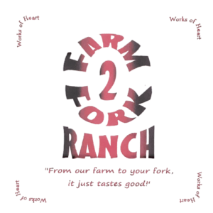
Our farm is called Farm2Fork Ranch. Our slogan is “From our farm to your fork, it just tastes good!” When we began, we were looking at just selling meat and eggs. Greg came up with Farm2Fork. We thought having the number in there, with everything all smashed together, would better stick in people’s minds. Then Greg said we needed a “thing.” I didn’t understand what he meant. He finally said, “You know, like Campbell’s: ‘Mmm, mmm good’!” A slogan! That came easy to me. From our farm to your fork, it just tastes good! He wondered how I did that. I’m just good at filling in the blanks like that. Next was to see if that name was taken. Google to the rescue! We Googled Farm2Fork and sure enough there were a couple college programs named that. (Checking the availability of your name is a must, so as not to infringe on copyrights and trademarks!) We added Ranch and we were good! Okay. The name was fine and not taken; now, how should it look?
I started playing with fonts, because I wanted something easy to read that also captured the eye. Blending fonts did the trick for the look that felt right. I next played with colors. Green appealed to me. Greg wanted something more drastic. So we went with red and black. I had solid colors at first, but felt that wasn’t quite good enough. Playing around with the lettering, I figured out how to fade the colors together. Not bad. Striking even. Next, Greg wanted the logo to be round. A round design on a rectangular business card just didn’t seem right to me, so I made them square. A square business card? Yes. Greg wasn’t too pleased with my final product. It just didn’t make sense to him. So I suggested getting feedback from the guys at work. (Greg works off-farm and always seems to run ideas by the guys at work.) When he came home from work the next day, I asked what the guys thought of it. They loved it! Their comments included: “It fits in your hand really well, and you won’t lose it as easily”; “It will stick out from the other business cards in a stack and keep you grabbing it to see which one is different.”
And that is how we came up with our logo and slogan.

We then added our information on the back of the card, so it was two-sided. We listed our names, place of business, website, and phone number (the biggest part of the back side). I also alternated between red and black for that information.


1 Comment
Informative, well illustrated article. Fits my experience with a restaurant, a bakery, an incorporated church Ministry st.
Now semi retired at 70 I’m looking for one if not two new businesses. One involving sewing and painting, the other hosting a farmer’s market on Saturdays and a farm stand most of the other days. I have a name for the produce and eggs stand but nothing yet for the art or crafts and sewing.